UX Research and ECommerce UI Design

Project outline
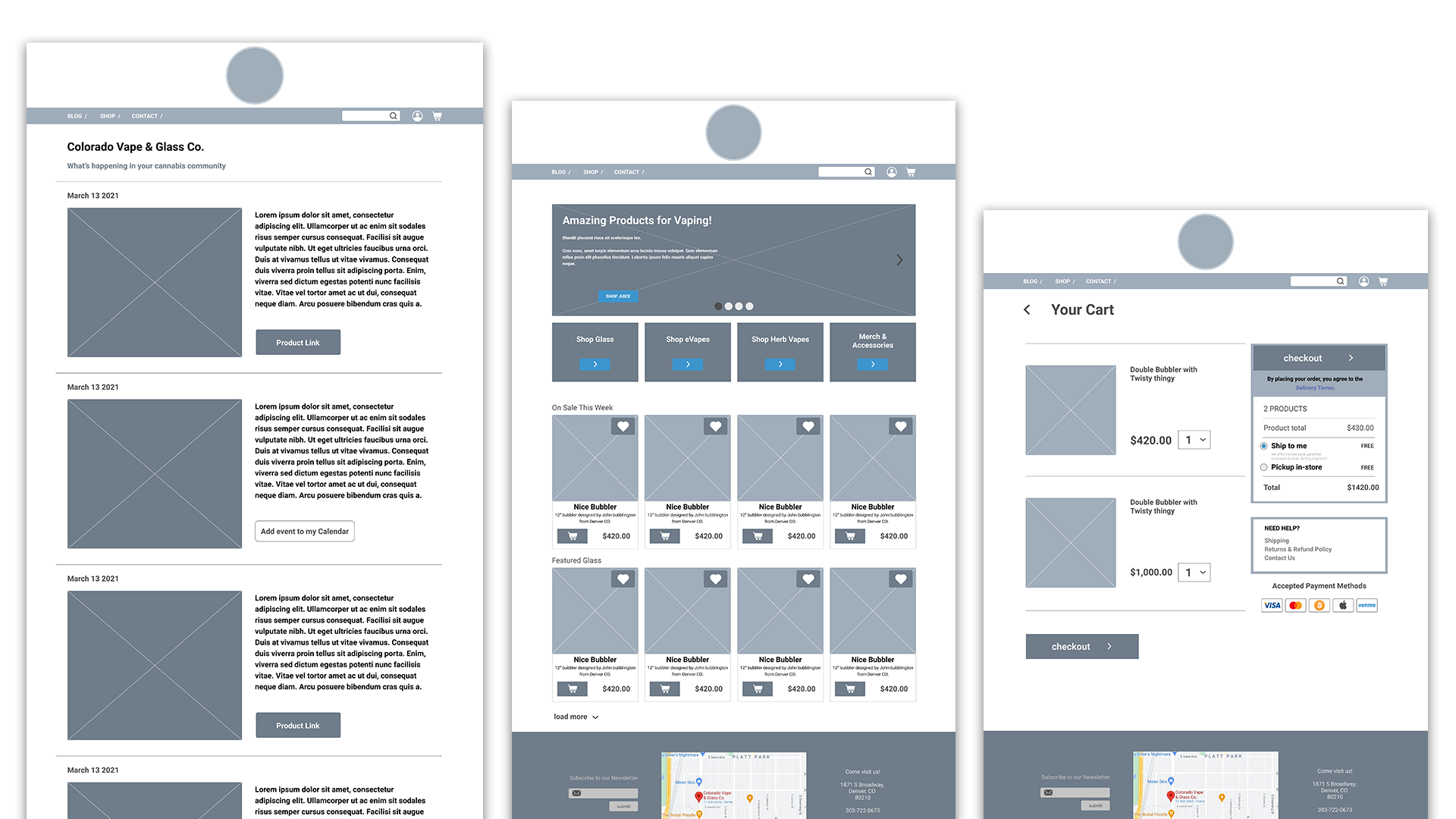
During the course of a 2-week design sprint I was tasked with redesigning an outdated website which contained an ecommerce section. Colorado Vape and Glass Co. specializes in vapes, glass smoke-wear, and various other products that were difficult, if at all possible, to shop for and purchase through their website. My objectives were to understand their users, redesign the website and ecommerce for usability, and create clean project files that could be easily handed off to developers.
Colorado Vape and glass logo
Research objectives
Some of things I needed to learn about the 9 users I interviewed:

- How do they shop online?
- Which eCommerce sites do they like and why?
- What are some frustrations my users shared?
- What are some necessary features for online shopping?
- How to make them feel comfortable (and safe) while making a transaction.
Realizations and findings
Every good website starts with a smooth landing. I had 5 people test the current site and they all made it very clear that they wouldn't move past the home page until it was rebuilt.


- 5/5 users said they would leave the site immediately upon loading it.


- 5/5 users would not trust a poorly built website with their money.


When I begun interviewing potential users about their shopping habits I realized the users had no way to connect with the company or learn about it in any way. They had various needs depending on the type of person shopping there. For example, there are at least 3 different groups of cannabis users who shop at this store:

- Medical user: uses cannabis descretely and simply for the purposes of medicating.

- Recreational user: this user smokes socially without a necesity for the medicinal properties.

Tourist: this user is mostly looking for the fast, easy, disposable way to consume cannabis.
Re-Structuring in order to guide our users
I found that the more I learned about my users, the more I needed to focus on a simple and intuitive way to navigate. We needed to simplify the site without removing important features so my solution was to create a blog on the home level as a way for not only the customer to engage with the business, but also the company to post important things that are happening.
Creating mid-fidelity prototypes
Quickly sketching wireframes to visualize my users flows.
Creating high-fidelity prototypes
One thing I kept in mind during the ideation was that users will be coming to this site from laptops as well as phones so I wanted to make sure to establish layouts and components for various devices and breakpoints.
Files worth Developing
As the site was being designed I spent the extra time making sure my components and variables were organized and named properly, my styles, typefaces and fonts were clearly defined and structured. This makes everyone's job easier and more productive down the pipeline.